
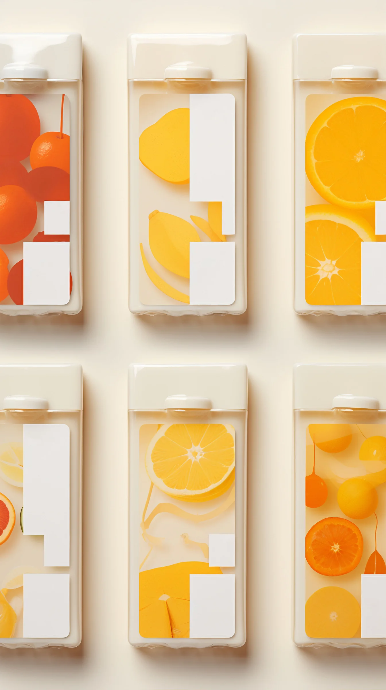
A six-flavour range of chilled juices for a Seoul cold-press producer, sold through convenience stores where the shelf is lit from above and every competitor is opaque.
Pomelo Brand Lab started from a complaint. The client’s juice looks good and nobody sees it. Cartons hide the product; clear bottles show it but scratch, label badly and read as cheap. The studio’s answer was a gable-top carton in clear rPET with a moulded shoulder and a flat white closure, printed on the front face only.
That printed face is a graphic of the fruit at roughly life size, in flat colour with no shading: whole cherries and half oranges for the blend, a lemon and its peel for the citrus, a grapefruit wedge, a cluster of kumquats. The illustrations are cropped hard by the edge of the panel, so a slice runs off the side and continues in the eye. Behind the print, the actual juice is visible through the unprinted areas, and the two colours — printed fruit and real liquid — are matched within a narrow tolerance so that the pack appears filled with the thing it depicts.
Two blank white rectangles sit on each pack, offset from one another. They carry the flavour name, volume and nutrition panel, and their position shifts by SKU, which produces the staggered rhythm visible when the range is faced up. The studio treated those blanks as a structural part of the composition rather than as a label dropped on afterwards.
There is no logo lock-up on the front. The brand mark appears once, small, on the closure.
Production ran into the usual difficulty: printing white on clear at speed, with enough opacity to hold text, on a substrate that flexes. Three passes were needed and the line speed dropped by a fifth. The producer accepted the cost after a shelf test in which the range outsold its predecessor by a wide margin in its first six weeks.
The jury gave this the category’s top award for the discipline of the idea and the quality of its execution. Several jurors noted that the design does one thing — makes the contents and the graphic the same object — and refuses every opportunity to do more. The blank label panels drew particular praise as a rare case of regulatory copy being planned into a composition rather than tolerated at the end of it.
Pomelo Brand Lab is a Seoul studio of eleven, working on packaging and identity for food and beverage clients across Korea and Japan. Founded in 2016 by Ji-woo Han and Sang-min Oh, both formerly in-house at a large FMCG group, the office was set up specifically to work on production-constrained packaging rather than concept work. It runs press trials as part of its design phase and shares a workshop with a Paju printer. The studio publishes its failed press tests alongside its finished projects. Han leads structure and production, Oh the graphics. The office takes on around fifteen projects a year and has a stated rule that it will not present a concept it has not confirmed a printer can run.